Euramax brandbook

Een eenduidige huisstijl draagt bij aan een zichtbaar en herkenbaar Euramax. Binnen de huisstijl zijn er diverse eigenschappen die het gezicht bepalen. Deze handleiding laat zien wat de bouwstenen zijn waarmee een ontwerper aan de slag kan om naar eigen inzicht middelen te creëeren.

Logo

Our logo stands for clarity. Clarity is found in the solid nature of our wordmark, symbolising the strong fundament of our company. Connection is found in the ‘ligature’ between the ‘u’ and the ‘r’ in the wordmark. This symbolises the combination of quality and service and the interaction between us and our customers.

Our divisions are identified by their own descriptor.

Our General Brand:  The Cladding Material Company

Logo with descriptor in color

Logo with descriptor in white

Logo with descriptor in black

Our division which services the whole architectural industry

Logo with descriptor in color

Logo with descriptor in white

Logo with descriptor in black

Our division which services the whole mobility industry

Logo with descriptor in color

Logo with descriptor in white

Logo with descriptor in black

Wordmark in color

Wordmark in white

Wordmark in black

Brand icon in color

Brand icon in white

Brand icon in black

A minimum margin is recommended for optimal communication purposes. The margin is based on the brand icon (which is based on the way the letters u + r of ‘Euramax’ are connected).

Do’s

Use logo only in the right brand colours.

If colour is not an option, only use a black or white version.

An inverted version of the logo is only used on a black background or a colour from the brand palette.

The logo can only be placed on an image if it achieves enough contrast. Make an informed decision whether to use the black or white version of the logo, depending on the type of image.

Don’ts

Never change, ad or use colors other then our colour palette.

Never change, ad or use other typefaces.

Never use outlines or other filters for the logo.

Never alter, skew or distort the logo.

Typography

As our primary typeface we use Roc Grotesk. A sans serif grotesk inspired by the craftsmanship for creating American wood type from the end of the 19th century. It comes in a number of weights in order to cover a wide scope of applications.

For our communication requirements we use the Roc Grotesk Normal and Wide. Which gives consistency as well as flexibility.

Its Bold counterpart is spaced in such a way that the width of the text column will be similar to the text set in Regular.

  • For the logo we customized a Roc Grotesk Wide Bold.
  • For the logo descriptors we used the Roc Grotesk Wide Medium in ALL CAPS.

The Roc Grotesk font family is via Adobe Fonts

Roc Grotesk Wide

For use in headlines and highlighted text. Preferably normal written, with lower-case letters starting with a capital letter. Occasionally lines of an all-caps text can be used to emphasize text. Because no uppercase letter descends below the baseline, the lines of an all-caps text can be packed tightly on a poster or a headline for example.

Roc Grotesk

The Regular style is somewhat generously spaced, as it is most likely to be used for setting longer passages of text.

Colors

Green is the colour of nature and health. It represents growth, connection and safety. Green is a relaxing colour that is easy on the eye. We picked a premium green, which stands for craft and service.

Primary green

HEX: #00826E
RGB: R 0 / G 130 / B 110

CMYK: 95  / M 0 / Y 60 / K 20
PMS: 569 C

Primary shade

HEX: #00342C
RGB: R 0 / G 52 / B 44

CMYK: C 92 / M 48 / Y 70 / K 66

Primary tint (20%)

HEX: #CCE6E2
RGB: R 204 / G 230 / B 226

CMYK: C 25 / M 0 / Y 15 / K 0

Tints

Tint 80%

HEX: #339B8B
RGB: R 51 / G 155 / B 139

CMYK: C 75 / M 10 / Y 50 / K 10

Tint 60%

HEX: #66B4A8
RGB: R 102 / G 180 / B 168

CMYK: C 60 / M 10 / Y 40 / K 0

Tint 40%

HEX: #99CDC5
RGB: R 153 / G 205 / B 197

CMYK: C 45 / M 5 / Y 30 / K 0

Shades

Shade 1

HEX: #006858
RGB: R 0 / G 104 / B 88

CMYK: C 80 / M 20 / Y 60 / K 40

Shade 2

HEX: #004E42
RGB: R 0 / G 78 / B 66

CMYK: C 85 / M 30 / Y 60 / K 55

Shade 4

HEX: #001A16
RGB: R 0 / G 26 / B 22

CMYK: C 80 / M 50 / Y 60 / K 85

Layout

A few examples of resources

Brand story

Euramax creates cladding materials for mobility and architectural customers. Materials that meet the highest standards and last a lifetime. Materials created by the proud and loyal craftsmen of Euramax. Finely tuned experts, working with top notch tools, creating only the best of the best.

We have been doing so since 1969. In that heritage lies the foundation of our quality. Quality that is built on a culture of driven, progressive and curious professionals. It is this culture that has allowed us to build long-term partnerships with our customers and to always remain relevant and current. You could say we have been contemporary since 1969.

We do not do this by ourselves. We work side by side with our customers. We understand their business, their needs, their challenges. We are 100% committed to help our customers succeed and get the max out of their potential.

To do so, we go beyond the ordinary. Beyond what is expected. It is this agility that allows us to deliver bespoke solutions to whatever challenge our clients’ put before us.

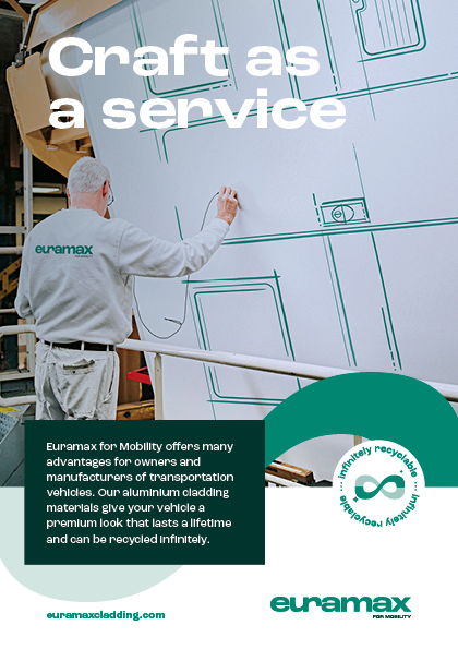
That’s what we call ‘Craft as a Service’. When maximum quality and service are combined with maximum focus and commitment.
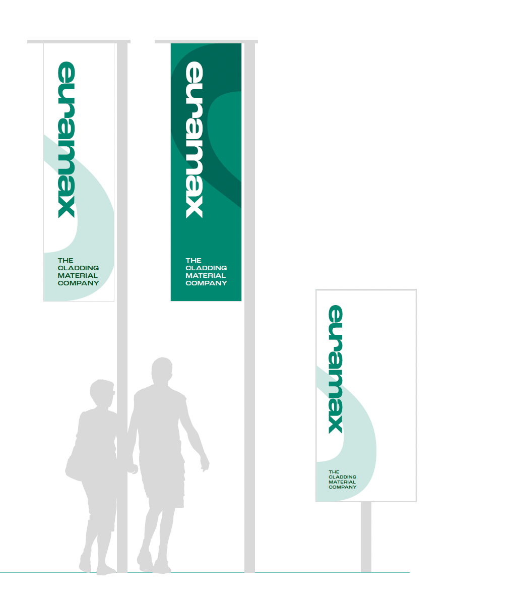
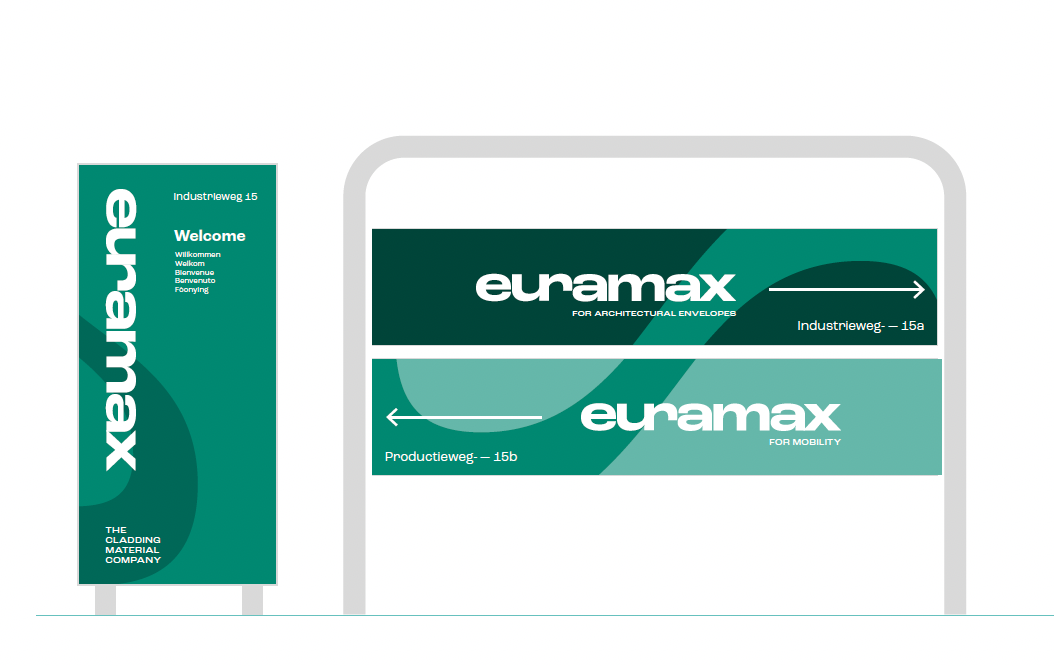
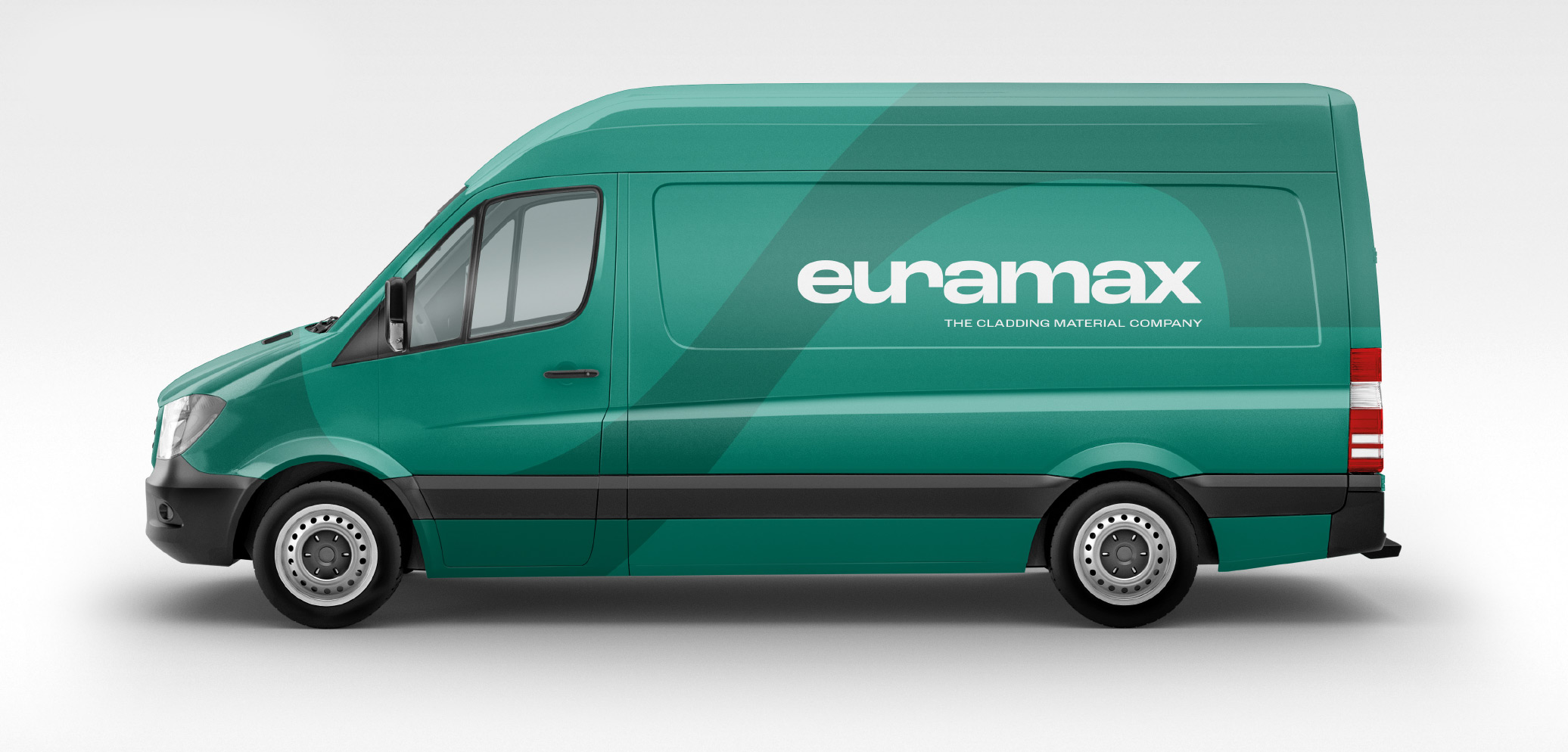
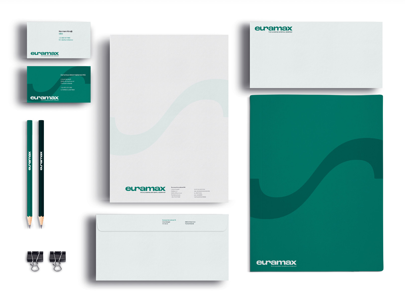
Euramax
The Cladding Material Company